Typography
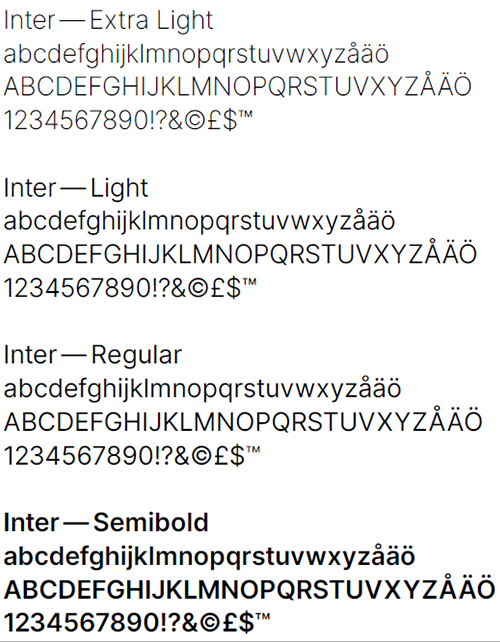
Typography is a very important part of our identity. Inter is a typeface that reflects the values of our brand and will become a part of the Bravida personality. Inter is available in a wide range of weights and styles, but in order to keep things simple and consistent Bravida use four of these.
Headlines
Inter Light is used for headlines throughout our communication. When headlines are above 25 pt in size use Inter Extra Light.
Intro
Inter Regular
Body text
Body text should always be set in Inter Regular in at least 8 points. Always set body text in 100% of an approved Bravida color, black or white. In order to retain legibility, avoid setting text smaller than 6 points.
Subheader
For subheaders use Inter Semibold.
Download Bravida Typeface Inter
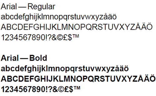
Fallback typeface
When Inter is not available, such as in Word or Powerpoint Arial should be used. Arial is one of the most common typefaces and is available on most computers.